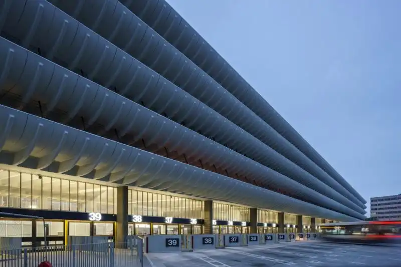
▼从汽车停车场看汽车站,view from bus parking square
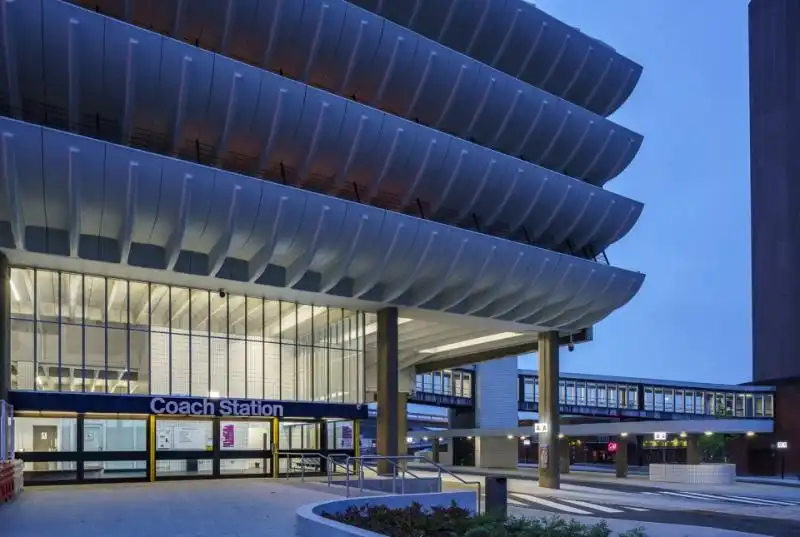
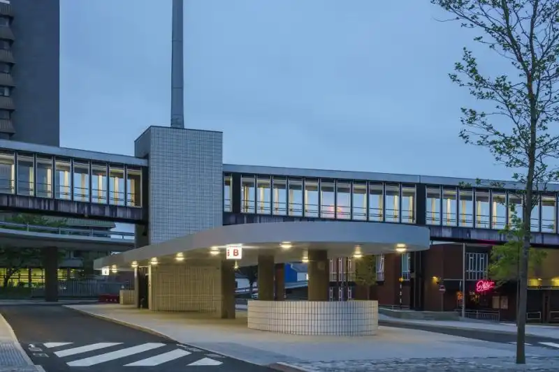
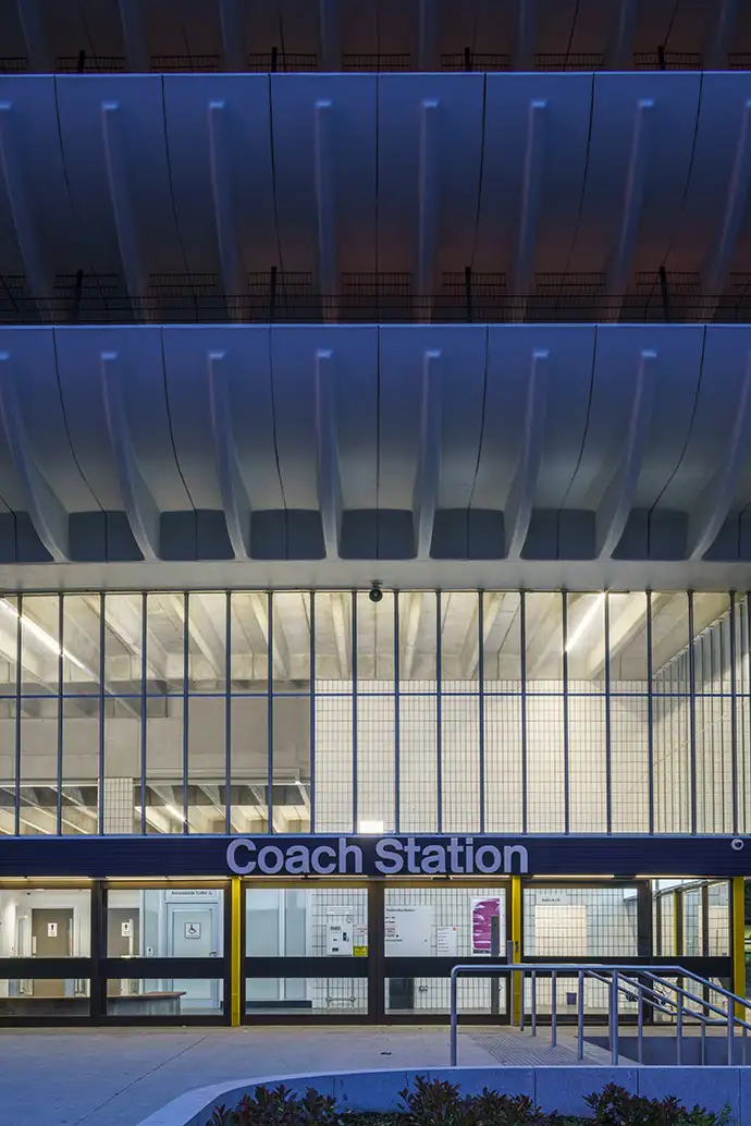
▼入口广场看汽车站,view from entrance space
建筑师加固了汽车站的入口并且建造了一个新的入口大厅来增加空间的流动性并引导方向和人流。建筑师关注的重点也发生了变化:从1960年代优先考虑车辆通行到现在优先考虑旅客通行。未来,旅客可以从车站前宽阔的地面广场很方便地进入大厅。这个场地原本是汽车停车场,难看的遮挡物阻碍了旅客安全地进入建筑,人们并不想乘坐地铁到这里,因此1960年建造地铁在2017年被关闭。
▼入口大厅和车站前广场,entrance hall and public square
除了必要的修复工作,建筑的外部也发生了变化,比如将整个车站大厅层的玻璃和框架在保持原有竖向美感的前提下进行替换。原有地面层的木制门框也替换为青铜色铝制门框,既与原来木材颜色相同又实现了自动开启、关闭功能。同样,延续1960年代的设计,立面通过连续水平背光带和三维立体标识设计重新焕发生机。
The exterior of the building has had some changes in addition to required maintenance works. These include replacing the concourse level glazing throughout by removing the original glass and its framing and replacing these with mullions of the same profile to maintain the original aesthetic. The timber framed doors on the ground floor facade have been replaced with bronze coloured anodised aluminium framed doors that are similar in tone to the wood that was used previously while allowing for automation.The faade is animated by a continuous back-lit horizontal band internally which has now been bought back to life and by three-dimensional external signage, again in keeping with the 1960s design.
▼连续水平背光带让立面恢复生机,continuous back-lit horizontal band
从城市主义的角度出发,John Puttick事务所在汽车站的西侧新设置了一个面向公共广场的座位区和等候区,这个区域将于2019年完工并将改善车站与城市中心的联系。汽车入口位于汽车站东侧,车站中心区域设置了问讯处,咖啡厅,商店和其他设施,如汽车公司办公室。车站专门设置了一个独立的部分24小时为长途巴士服务,当车站其他部分关闭时,玻璃门可以将这个部分与其它关闭部分隔离开。
From an urbanistic perspective, John Puttick Associates has arranged the building so that its West side with a new seating and waiting area faces the public square which when completed in 2019 will also improve a sense of connection with the city centre. The East side is devoted to the bus gates. At the core of the building are the information centre, cafe, shops and other facilities including the bus company offices.A dedicated part of the station now serves long distance coaches on a 24-hour basis. This has been designed to function as a stand-alone entity by separating it with glass screens when the rest of the station is closed.
▼24小时长途巴士服务区设计为单独体块,stand-alone entity forlong distance coaches on a 24-hour basis
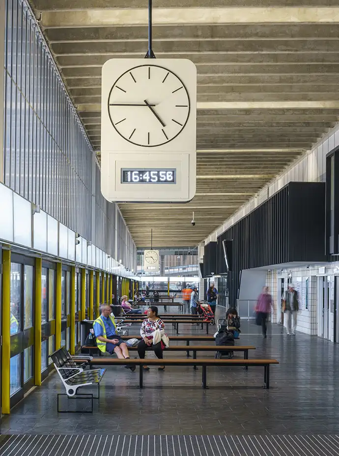
▼汽车等候区,waiting area
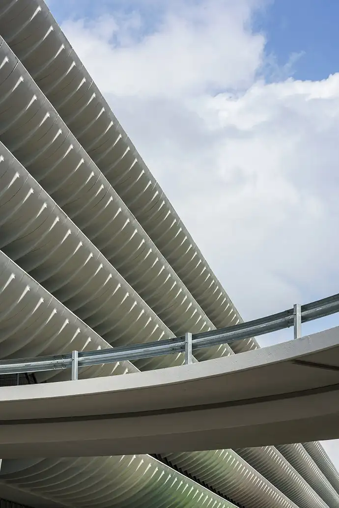
▼立面细部,facade detail
为了复原其充满力量感的原始设计,John Puttick建筑事务所对室内环境做了减法,恢复其原有材料和色彩。整体现存的元素都得到了精心的复原,大部分现存装饰状况良好,只是被内部杂乱的环境所遮蔽。
In order to reinstate the powerful original design, John Puttick Associates has pared down the interior and returned features to their original material and colour palette. Overall existing elements have been carefully restored, many of which were in good condition but had been compromised due to visual clutter within the building.
▼恢复原有材料颜色,室内环境做减法,returned features to their original material and colour palette
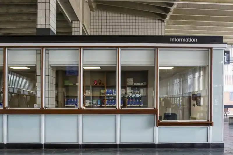
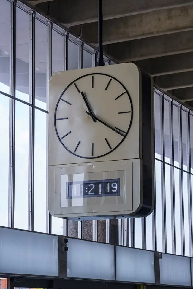
John Puttick建筑事务所最大可能地利用原始材料和装置。建筑师利用汽车隔离门剩余的材料设计了Iroko长椅并将长椅作为空间分隔的一部分。同样的材料也被用于问讯处的前台,这样可以使经常触碰的区域充满温暖感。建筑师修复了原有的弧线长椅,保留了原有的钟表和Pirelli橡胶地板。
John Puttick Associates has made the most of original materials and fittings wherever possible. The architects have designed Iroko benches from the bus gate dividers left over as part of the reorganisation of the space.The same timber has also been used at the information point reception desk, bringing tactile warmth to areas frequently touched. The original curved benches have been restored. The original clocks and rubber flooring by Pirelli are still in place.
▼最大可能地利用原始材料和装置,remain most oforiginal materials and fittings wherever possible
▼采用与Iroko长椅相同材料的问讯处,information desk used the same material of Iroko bench
▼原有的钟表被保留下来,original clocks remain in the same space
新加入的元素继承了1960年代延续的设计精神,比如标识设计采用了车站原先使用的橙色和黑色,同时这也是British Rail一直以来的通用色。车站内的木构架都恢复为原有的深灰色。吸顶灯被更换为原来使用的带混凝土底座的分散光源灯,这些混凝土底座在修复工程中已经进行了清洁。更大的介入元素,如新的信息和行政区域,也贯彻了原有建筑在细节之处的实用精神。
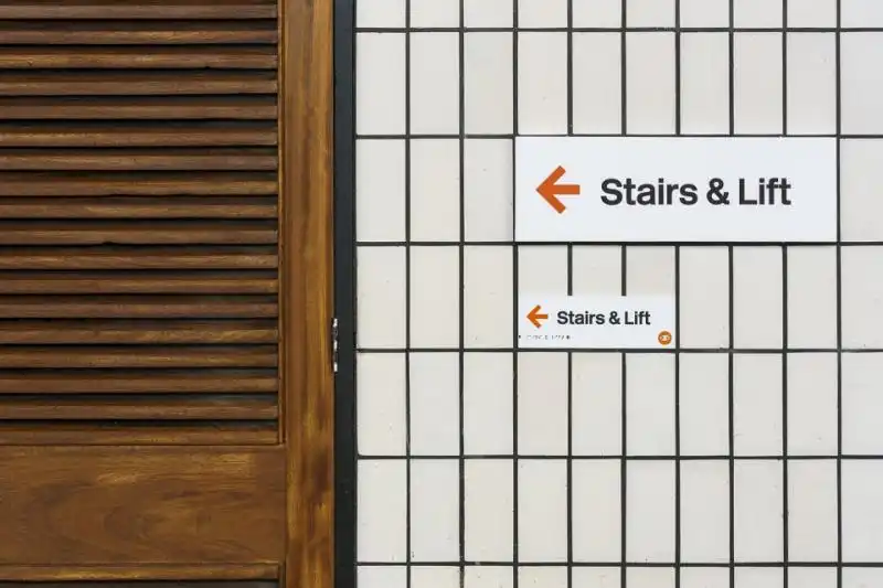
New elements are in keeping with the spirit of the 1960s design. For example, the signage is designed in orange and black colours that reflect the ones first used at the station whilst also reintroducing the British Rail type face which was originally used throughout.All the timber panel work in the building has been returned to its original dark grey. The surface mounted lights have been replaced, reinstating the original discrete up lighting that reflects from the concrete soffit which has been cleaned as part of the refurbishment works.Larger interventions – such as the new information and administrative area – have been detailed in the utilitarian spirit of the original building while clearly being of the present.
▼木制门框替换为同样颜色的铝制门框,bronze coloured anodised aluminium framed door
▼橙色和黑色车站标识,orange and blacksignage
John Puttick建筑事务所与The Twentieth Century Society紧密合作,商榷修复具有重要历史特征的Preston汽车站的措施。设计的首要的任务是确保车站足够坚固,能够提供10000人次/周的服务并且为旅客提供愉悦体验的同时保留车站重要的地标特征。在修复扩建过程中,Preston汽车站仍在保持运行。明年,John Puttick建筑事务所将完成在其邻近位置面积为2600平方米的Youth Zone建筑工程。
John Puttick Associates worked closely with The Twentieth Century Society to determine the approach to the restoration of historically significant features of Preston Bus Station. The overarching objective has been to ensure the Bus Station is robust enough to service 10 000 departures per week whilst creating an uplifting experience for passengers and preserving the important landmark status of the building.Preston Bus Station has remained in operation throughout the building works. Next year sees the completion of the adjacent new build 2600 square metre Youth Zone building also by John Puttick Associates.
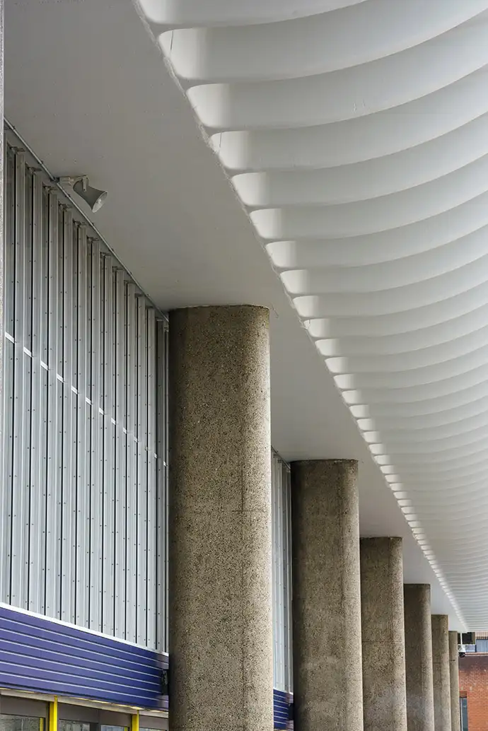
▼保持原有粗野的历史特征,preserve the important landmark status of the building
车站属Lancashire市议会所有,市议会于2015年英国皇家建筑师协会举办竞赛后,任命John Puttick建筑事务所负责车站修护和扩建工程。John Puttick说:“非常荣幸能够参与像Preston汽车站这样一个对旅客充满友好姿态的的项目。它外在的尺度很大并富有纪念性但内部却非常人性化。我们的目标在于恢复车站有效运行模式同时以富有敏感度的细节提供建筑人性化的尺度。在建筑最繁忙的时候,旅客仍然可以感受到其效率和人性化,这使得车站成为一个充满庄重感的地方。”
The Station is owned by Lancashire City Council who appointed John Puttick Associates in 2015 to refurbish and extend building as the result of an architectural competition organised by the Royal Institute of British Architects.John Puttick says, “It has been a privilege to work on a project that celebrates passenger experience in the way Preston Bus Station did when it opened. Its scale and monumentality are well known but inside the building one appreciates the way it welcomed people. Our goal has been to bring back the clarity of movement achieved in the original design, as well as the sensitive details which bring a human scale to the building. These qualities are tangible even when the Station is at its busiest making it a dignified place to be.”
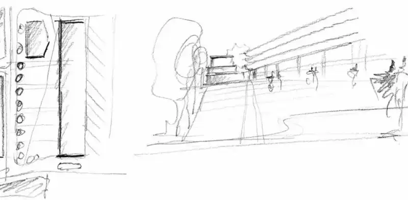
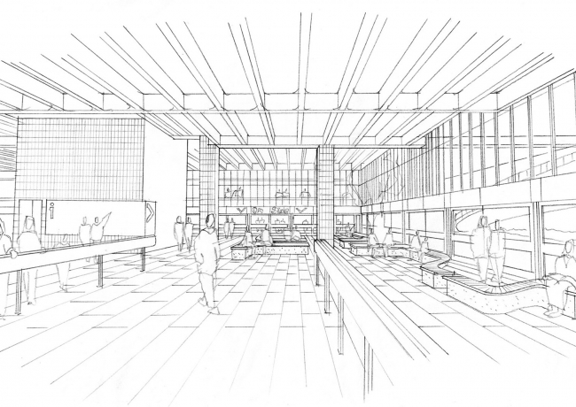
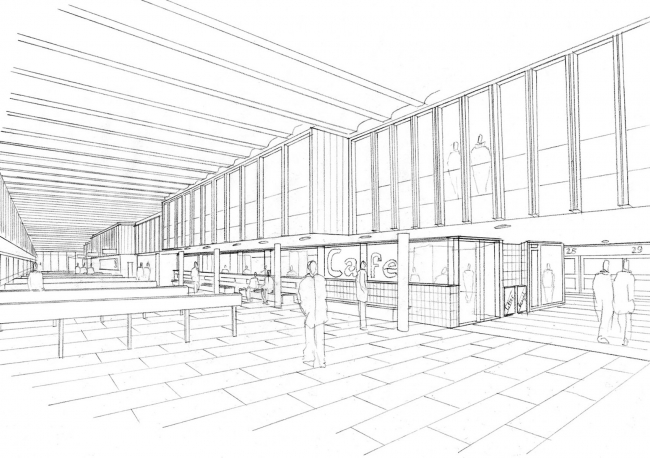
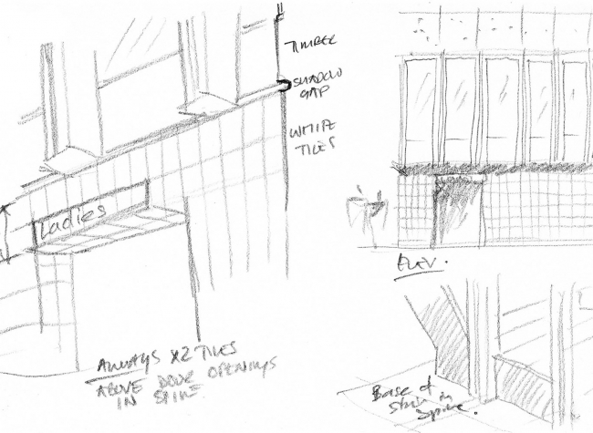
▼设计草图,design sketch
Twentieth Century Society的高级顾问Claire Price评价说:“The Twentieth Century Society与设计团队详细商讨,以确保Preston汽车站这座保护建筑未来的样子。协会称赞设计团队在修复中非常注重细节,并且仔细的考虑了新Youth Zone对于保护建筑的影响。”
Claire Price, Senior Conservation Adviser, Twentieth Century Society, says,“The Twentieth Century Society have been involved in detailed consultations with the design team to ensure a secure future for the listed Preston Bus Station. The Society commends the team’s attention to detail in the Bus Station refurbishment and careful consideration of the impact of the new Youth Zone on the setting of the listed building.”
▼场地平面图,master plan
▼平面图, plan
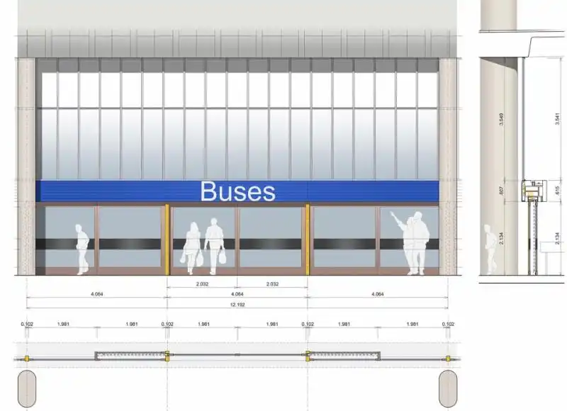
▼立面图,facade
